Optimizing Audience Builder for faster & simpler Ad targeting

Design Solution
Making audience building effortless and accurate
A clearer visual structure, and simpler steps to build logic
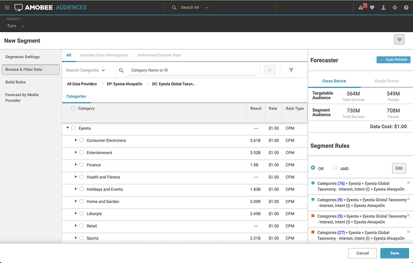
The original interface had no visual structure, making rules hard to read and requiring many clicks to configure. The new tree structure makes rule logic easy to follow and simplifies the steps to build one.
From unrestricted to purposeful flexibility
The current tool was error-prone due to excessive flexibility in freely changing operators between categories.
I intentionally constrained this flexibility to help users build rules that better align with their expectations, while introducing focused flexibility to enable faster creation of nested groups.
Explore impact through quick toggles
Toggling categories on and off in the audience rules allows users to quickly play with different combinations and see how each change affects the estimated reach, without deleting and re-adding categories. This streamlines exploration during audience building and makes it easier to revisit and troubleshoot rules when iterating later.
The most memorable moment
I Don't Design the Ask. I Design the Problem.
The interviews were supposed to confirm the brief. Instead, they told me we were building a tool for a problem our users didn't have.
We were asked to upgrade the UI of Audience Builder to make it more intuitive while handling complex logic structure. Before touching the UI, I ran a round of user interviews. But what I found was that the brief was solving the wrong problem. Instead of quietly adjusting the design on my own, I brought the findings to PM and engineering first, and proposed we treat this as a chance to rethink the whole building experience, not a UI polish task. That conversation turned a three-week polish job into a two-month redesign.
In the end, users got what they needed. But the real change happened before any wireframe: we agreed on what problem we were actually solving. That moment taught me that the brief is not always the real problem. And when that happens, a designer's job is to lead the team to solve the right one.
The impact
The new design significantly improved the work efficiency
Following the launch, the redesign received strong positive feedback from users, who described the new experience as clean, intuitive, and easy to follow. This translated into a measurable boost in efficiency, reflected in both reduced task completion time and improved completion rate.
Before
After


My role
Solo UX designer
Duration
May - July, 2021
Tools
Figma, Axure
Team
1 PM, 3 Engs
Project Overview
Audience targeting is critical, but the tool was failing users
Amobee provided a demand-side platform (DSP) that enables advertisers to plan, buy, and optimize digital ad campaigns across multiple channels. Audience targeting sits at the core of this workflow. It determines who sees an ad, directly shaping campaign performance and ad spend efficiency.
However, our Audience Builder tool had become increasingly difficult to use, and client feedback consistently flagged it as confusing and time-consuming. In response, we decided to redesign the experience and I led the project as a sole ux designer.
Domain context
Choosing who sees an ad is really a logic-building task
Amobee provides first‑party data (the advertiser’s own customer data), as well as third‑party data from external partners. Users can pick criteria from these data providers and mix them together to describe the audience they want to reach.
For example, pet brand wants to launch a campaign for their dog food. They pick up the criteria to describe the people they want to target — like dog owners, people who recently browsed this brand, and translate this into a rule the system can actually run — using boolean logic, which include 3 operators, OR, AND, and NOT.


Key to success
Uncovering the gap in users' mental model is what made this work
After conducting a ux heuristic evaluation, my initial assumption was that users needed a tool that could help users build deeply nested logic with ease - something the poor usability of the legacy tool failed to support.
However, after speaking with users, I found that was not the case. When they think about targeting, they naturally split the audience into two groups, people I want, and people I don't want. Also, most rules they built were flat, or at most two levels deep. They don't think in terms of one large and deeply nested boolean expression. So the old tool actually forced a simple intent into a much more flexible system than needed, and that mismatch was the source of the friction.

Design Explorations
Reshaping the tool to match how users actually think
Aligning the UI with how users think
The first thing I rethought was the structure of the rule builder itself. The old tool dumped every condition into one flat list, leaving users to manually sort them and wrap the excludes in a nested block. It didn’t align with their mental model as they split the audience into two groups, people I want, and people I don't want.

Where should the build flow start?
I wanted to see if a more guided flow would feel more natural and avoid making grouping mistake. I played around with a structure-first flow where users first decide where next condition would go in the structure, then searching for the data to fill it in. But it added more frictions.

How to make the rule's structure legible?
A solid visual foundation helps users clearly see how their changes affect audience rules during initial creation. It also enables them to quickly grasp the structure of previously built audiences when returning to iterate, reducing cognitive load and supporting efficient updates.

Keep iterating
Refining the design through testing and feedback
To evaluate how users perceived the new rule tree visualization, interaction patterns, and information hierarchy, I conducted moderated usability testing with five participants using a simple clickable prototype. Overall, users responded positively to the new design, finding it easier to understand and work with compared to the existing experience.
Iteration for better scannability
To reduce cognitive load while keeping the logic tree easy to scan and understand, I removed color and switch to neutral color. I also added clear text labels between nodes to make logical relationships more explicit and improve scannability.

Iteration removing technical limitations
During implementation, developers raised concerns that the floating “Add group” button would be difficult to implement and require extra effort to assess feasibility.
Considering that deeply nested groups would also make it hard for users to locate the correct add action, I moved the button next to the operator switcher and introduced a new “Branch” icon to better convey its purpose
